Creativity is something that I’ve used a lot in my life. I’ve always been involved in art and other creative ventures and I pride myself on my ability to create things. That’s why I wasn’t too worried about the concept for this ad as I was the execution.
Demographic

This was the demographic and product that I was assigned. When I thought of this person I thought of someone fairly stable. They’re in a relationship and have a decent income. Someone who is stable has time to focus on specific aspects of their life. That’s why instead of advertising this as something to make life easier I advertised it as something natural. I figured this demographic was more likely to be worried about all natural food and so I decided to play on that.
First Draft

This was my first very rough draft. I was proud of my blending of the spoon and tree but the background was bland and the words lacked any intriguing message. My teacher gave me some feedback that ended up leading to my final design.
Next Draft

I thought the spoon in my first draft wasn’t quite recognizable enough. That’s why I chose an image with an assortment of cookware in the image. I changed the tree to the leaves on top of a carrot. I also tried to focus on making the words a lot less obtrusive and keeping them simple. I think my message here is more clear and the ad is more visually appealing.
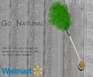
Resizing

Part of the project was to make two different sizes. I decided with less space to work in I wanted to focus on the spoon and my text. I couldn’t find a space for the other cookware anywhere in this image.
Conclusion
I’m proud of my final design. I ended up a little crunched for time so there are some things I would have liked to fix but overall I think it came together well.
Photos found at
Spoon and Cookware: https://pixabay.com/en/eat-cook-dine-kitchen-food-frisch-2096296/
Carrot: https://pixabay.com/en/carrot-root-vegetable-orange-33625/
