When I set out to create my own slide show I was excited. My whole life I’d only used previously made templates for my slide shows in Microsoft Powerpoint or Google Slides. It sounded like an exciting challenge.
Target Audience
Luckily the target audience for this was easy. We only had to think about Brother Lybbert so it allowed a lot more freedom to do what we wanted to do because he is more understanding of any design choice we go for.
Title Slide

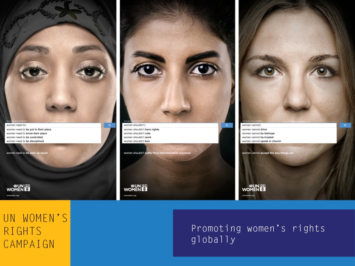
I’m pretty happy with the way this turned out. Originally I didn’t have enough focus on the original ad so I revamped it and came up with this. I think it makes the viewer more aware of what’s important.
Transition Slides


These two slides are the slides I designed to transition between content in my slides. I wanted a bright color scheme as I knew the content of my ad was dark. I wanted to be able to contrast that so my ad wasn’t too bleak. I originally had the three categories in their own slides but wanted to cut back so the show wasn’t too bloated.
Content Slides

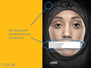
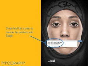
These are the slides I made analyzing the original ad. I tried to keep a very consistent layout across all slides so it’s easy to watch. Then I made another slide analyzing my own ad that turned out well.

Conclusion
This was a fun project that I’m very proud of! It gave me a chance to play around with colors and practice a skill that I’m excited to use again in the future.
Photo Credit:
https://pixabay.com/en/girl-woman-fashion-elegant-emotion-2209147/